There is currently a discussion about the constraint icons, perhaps they can be made more flexible:
https://forum.freecadweb.org/viewtopic.php?f=10&t=49972&p=467619#p467619
https://forum.freecadweb.org/viewtopic.php?f=3&t=54347&p=467618#p467618
Hi @st_phan how are you doing? Did you find any time to work on the icons? Perhaps if you share a style guide we can help making the icon set complete?
Hey all, a small “update”.
Just wanted to say my work on this is not dead, I just want to be transparent, because I think it will also give myself some relief, too.
Since my last real post here, there was actually quite some progress:
I created a script (which I am planning on publishing separately) that automates some of the manual work you have to do when properly preparing icons for export.
That together with some cleanup also made it easy to generate differently themed variations, e.g. a dark theme which can be seen here.
It would be basically only a few hours until that stuff is complete.
However in the recent weeks/months I just feel super drained – not only about contributing for FreeCAD, but life in general. When I talk to friends they feel similar (due to the whole Covid/lockdown-situation). One friend sent me this article by the New York Times which calls this mood “Languishing”.
So what does this mean: That I’ll post here once I can find some motivation again.
Thanks already for all the kind words and the interest in my work 
Thanks for sharing. I’ve seen this article circulating and it’s good that more people are aware of this condition. I’m sure others online especially in our niche of Free Libre Opensource software are also feeling it. Thank you so much for checking in. Feel free to reach out and let us know if you need anything.
I feel the same, though it’s more the “lockdown” than the “covid” which affects me.
Hi st_phan, how you doing? I hope you and your loved ones came thought the covid crisis healthy. I wonder if you could share a updated Figma file. The copy vanuan shared is outdated I think? (https://www.figma.com/file/g7WmhiormDyPj3Gt9SCc4i/FreeCAD-Icon-Theme-(Copy)?node-id=162%3A0) I would like to use it for a UI concept.
Thanks
Bumping 
Bumpy Bump!
Hope you’re doing well, eagerly looking forward to a release. I come from Shapr3d instead of Fusion/SW like some others, and your icons look so much better than the default ones in terms of usability (familiarity and being visually descriptive) 
Thanks again.
Thanks all for the kind words and that there is still interest – really cool
———
Update: Research
I do have an update, but it’s more research focussed. (But ideally until Sunday evening I am gonna have much more ready – fingers crossed.)
I paused the contribution due to personal struggles, lack of motivation (I think everyone can relate), but also doubts about a proper structure.
I want to share some insights about the last part.
Learning from others
A while ago I read this long, but great essay by Andy Matuschak and Michael Nielsen. One part of the essay (about tools for thought, but it applies here) that it takes large sums to invent something completely new, but afterwards (for competitors) it’s much cheaper to create something similar.
It might seem like a stretch to treat icons like this, but there is a surprising amount of hidden complexity.
I designed many icons in my life, but adding a few icons to a set is a different story than building a new one.
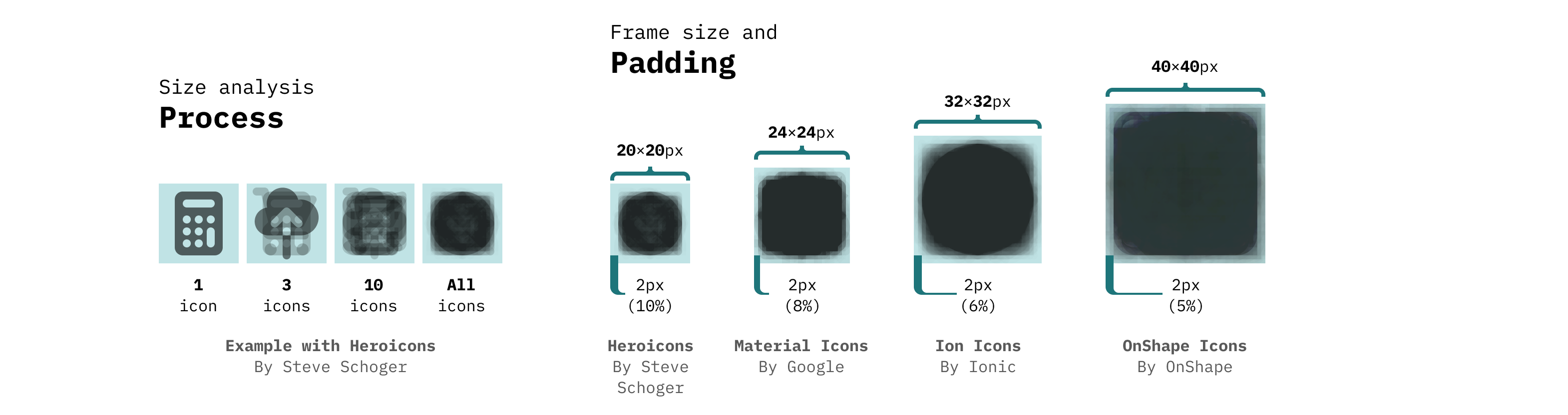
Size and safe area:
I took icons from icon sets that I find well designed and analysed how they are designed. Specifically the artboard size and padding/safe area:
Usage in apps:
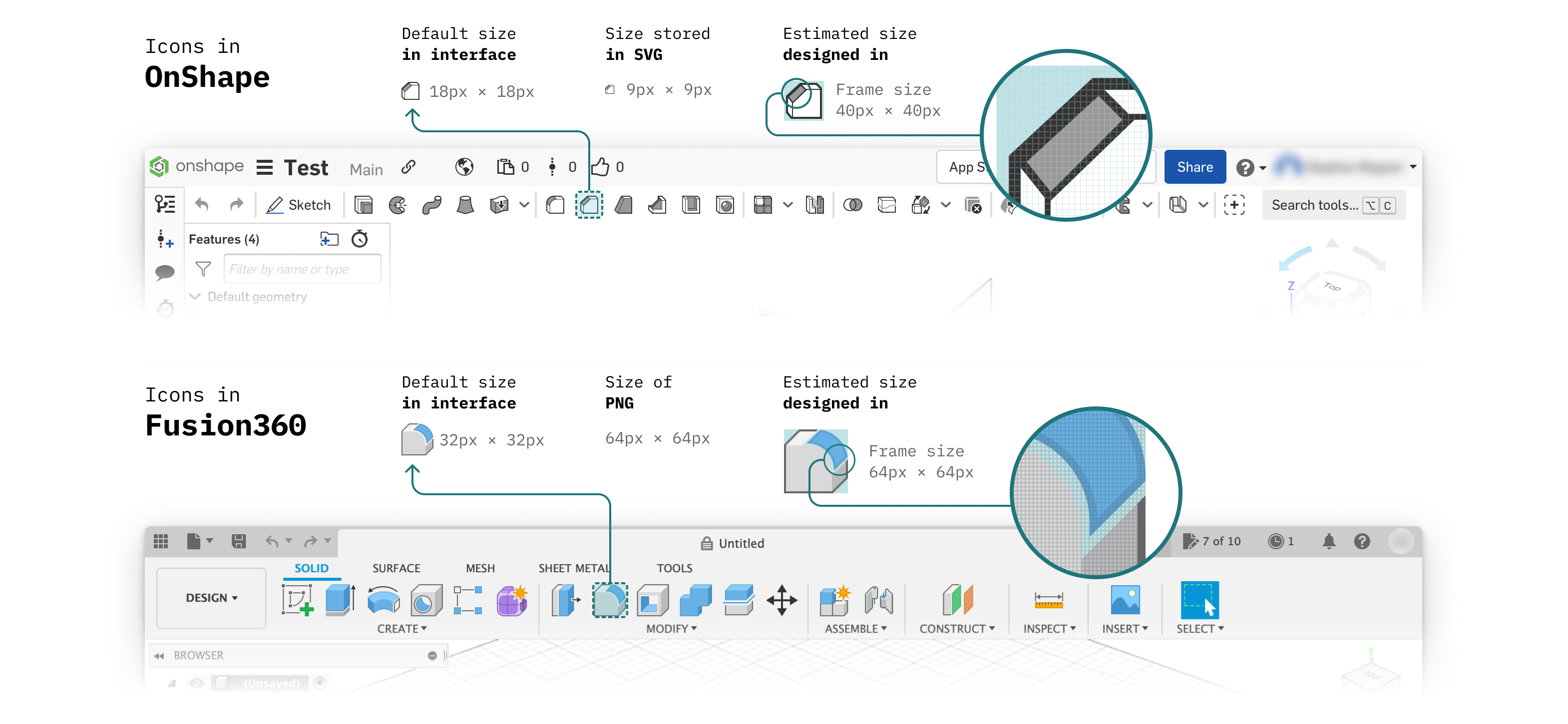
I looked at two CAD-Apps that I think are well designed – OnShape and Fusion360 – to see how those handle icons.
Automatic processing
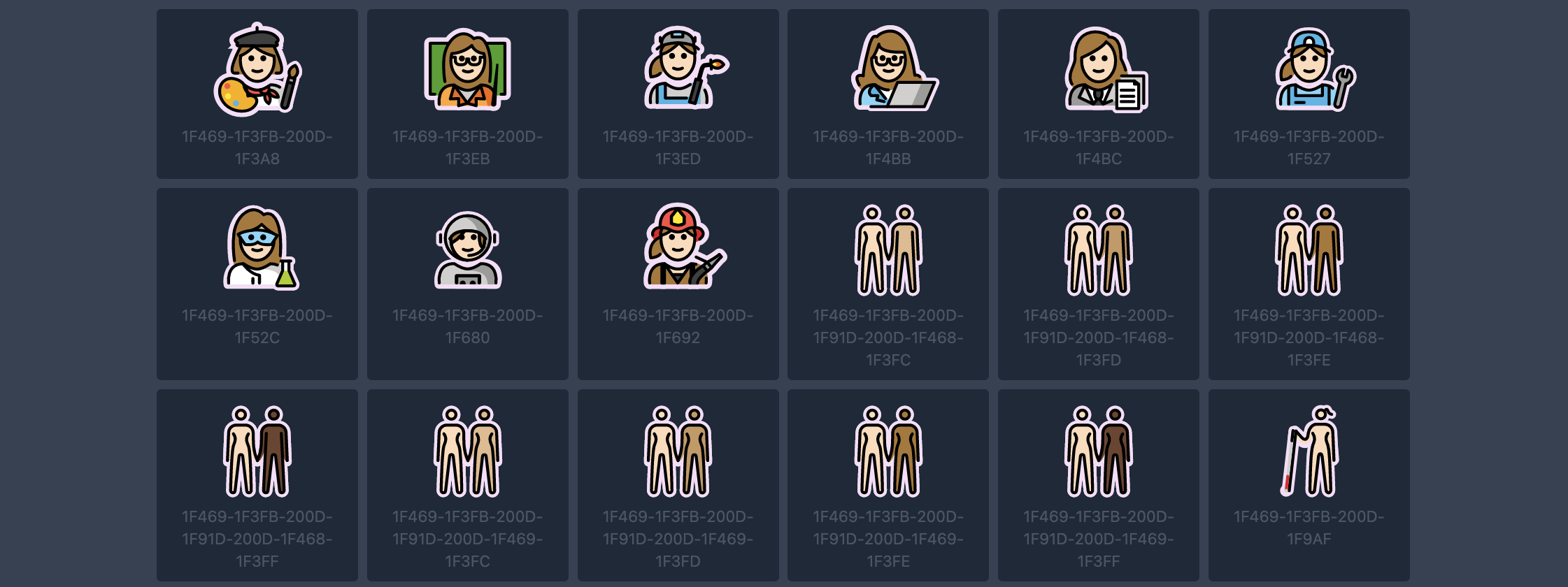
I did some work for and with the people behind OpenMoji. They have really impressive pipeline where they e.g. generate all the skin tone combinations for the hand shake emoji via code. I am helping them automate outlining the emojis for dark mode usage. Similar principles could be handy for handling icons.
Customization
One fear I had when designing the icons so far is that you are then stuck with exactly the icons as designed, since they are just images. It’s much easier to theme the window of an app, than its icons.
Apple has a really interesting system for their SF Symbols. They are available in multiple thicknesses, but also in multiple styles – most notably monochrome, hierarchical and multicolor.

They use a fairly limited set of colors that works across a huge range of icons. This limited and predefined set of colors means, that it’s easy to theme them – they have a dedicated app for that purpose?!

Conclusion
Those two aspects (the right design size + theming capabilities) were those I really wasn’t sure how to approach best.
But I think taking the best bits from what those companies are doing and adjusting them where needed, is gonna work nicely
And to get a bit more specific. For FreeCAD I want to apply the learnings in the following way:
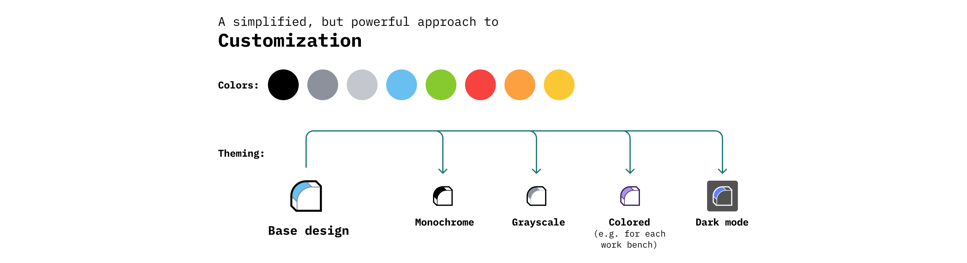
I use a simple set of colors that can (optionally) be adjusted via a script for theming purposes.
(It’s already late where I am, so a post regarding the design size is coming in the following days)
Great research 
Awesome, have a look at how kde does this stuff, the breeze icon theme has some colors that are taken from the system theme, I think the text foreground color is used as the main color of the icons, the svg also specifies a fallback color to be used.
here an example:
<svg xmlns="http://www.w3.org/2000/svg" viewBox="0 0 16 16">
    <defs id="defs1">
        <style type="text/css" id="current-color-scheme">
            .ColorScheme-Text {
                color:#eff0f1;
            }
        </style>
    </defs>
    <path style="fill:currentColor;fill-opacity:1;stroke:none"
        d="M3 2v12h10V2zm3 1h4a2 2 0 0 1 2 2v1a1 1 0 1 0 0 2v2l-1 1H5l-1-1V8a1 1 0 1 0 0-2V5a2 2 0 0 1 2-2zm-2 9h4v1H4zm6 0h2v1h-2z"
        class="ColorScheme-Text"/>
</svg>
taken from here:
https://invent.kde.org/frameworks/breeze-icons/-/blob/master/icons-dark/devices/16/drive-harddisk.svg
I would love a breeze based icon theme for FreeCAD in case it makes it easier for you
Thanks
That’s really interesting. I’ve known about currentColor which is e.g. used in HeroIcons to easily style them with CSS. But the embedded style sheet approach is new to me. Have to look into it a bit more!
@adrianinsaval TIL
SVG is pretty dang amazing.
Ok, last analysis for now:
Basically to find a good size to design in
I created the exact same icon in various artboard sizes with various stroke thicknesses and then compared their appearance when scaled down to the same size:
(As a reference I put also one icon from OnShape.)
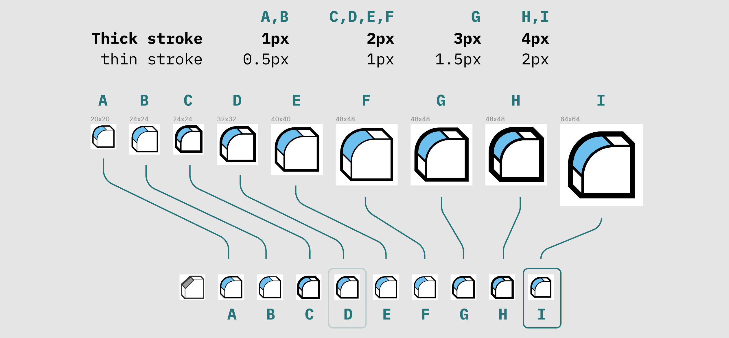
As I mentioned before I like the OnShape icons a lot but they can be very thin, so I wanted something that is slightly thicker, but has a similar vibe.
Thoughts:
I like D, G and I. The rest is IMO either too thick or too thin (which is problematic on older screens).
The problem with G is that it uses 3px and 1.5px which is awkward to work with, scales down badly and basically never renders cleanly.
Note: I actually designed the icons first in 24, then switched to 32px, because it got complicated.
Conclusion:
What I settled on now is I (so the version of D scaled up to 64px), because it’s easier to work with (especially with icons where there is more going on).
… That means now the hard work starts of adjusting the existing icons and creating a buttload of new ones 
Is there a way of making the margins dynamic without manually making different size icons to achieve this effect?
Sorry I don‘t think I get what you mean. Could you elaborate?
(You can easily add more padding or crop each icon to its individual bounding box if that‘s what you mean)
yeah that’s what I meant, cool. Is that done by some svg magic or do you need a script that produces many svgs of different sizes?
It depends:
- Various sizes: That’s the neat part about SVG. Since it’s a vector format (like CAD files) you only export it in one size and it can be scaled up or down indefinitely *
- Cropping to bounding box: I actually have never done it, but you’d need a script afaik. There are libraries like PaperJS out there to manipulate SVG files.
- Adding padding: That is normally done inside the application code. I don’t know how QT works, but on the web you can set “image-width: 20px, white-space-around: 4px” (pseudo-code as its written a bit differently)
*** Two notes here:**
(1) The only reason why one sets a certain artboard size is make the design process smoother. Then you know all outlines should be e.g. either 2px or 1px, can copy/paste styles and you don’t have to think about it much.
(2) One normally chooses something that divides well by 2, so it at least renders in 2 sizes (at 100% and 50% size) perfectly (= no blurry lines). This becomes less and less important the better the screens get but it’s still somewhat important.