We also faced the same polyline icon problem here https://forum.freecadweb.org/viewtopic.php?f=34&t=34687#p292208
Can be interesting
(we’ve chosen the left one)
Hey all, another update!
This time I focussed mainly on the icons for the Sketcher workspace 
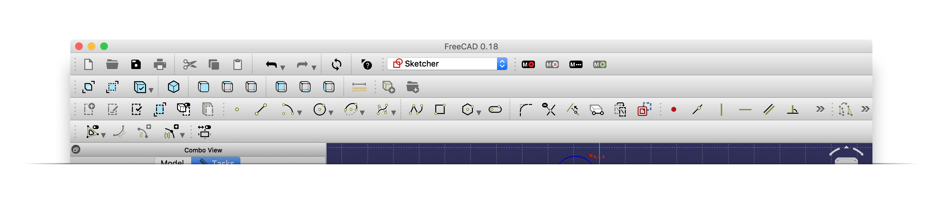
——— You can download the new .rcc file here ———
demo.rcc.zip (55.7 KB)
Note: Some icons don’t seem to be loaded/detected properly … I haven’t figured out why though yet.
———
Thanks @1D_Inc, @czinehuba @chrisb for the feedback, I tried to encorporate it
And sorry for not getting back to you @balrobs – the reason was simply that I didn’t have all ready yet at the last time.
———
Here is the comparison between the current icons and the new ones:
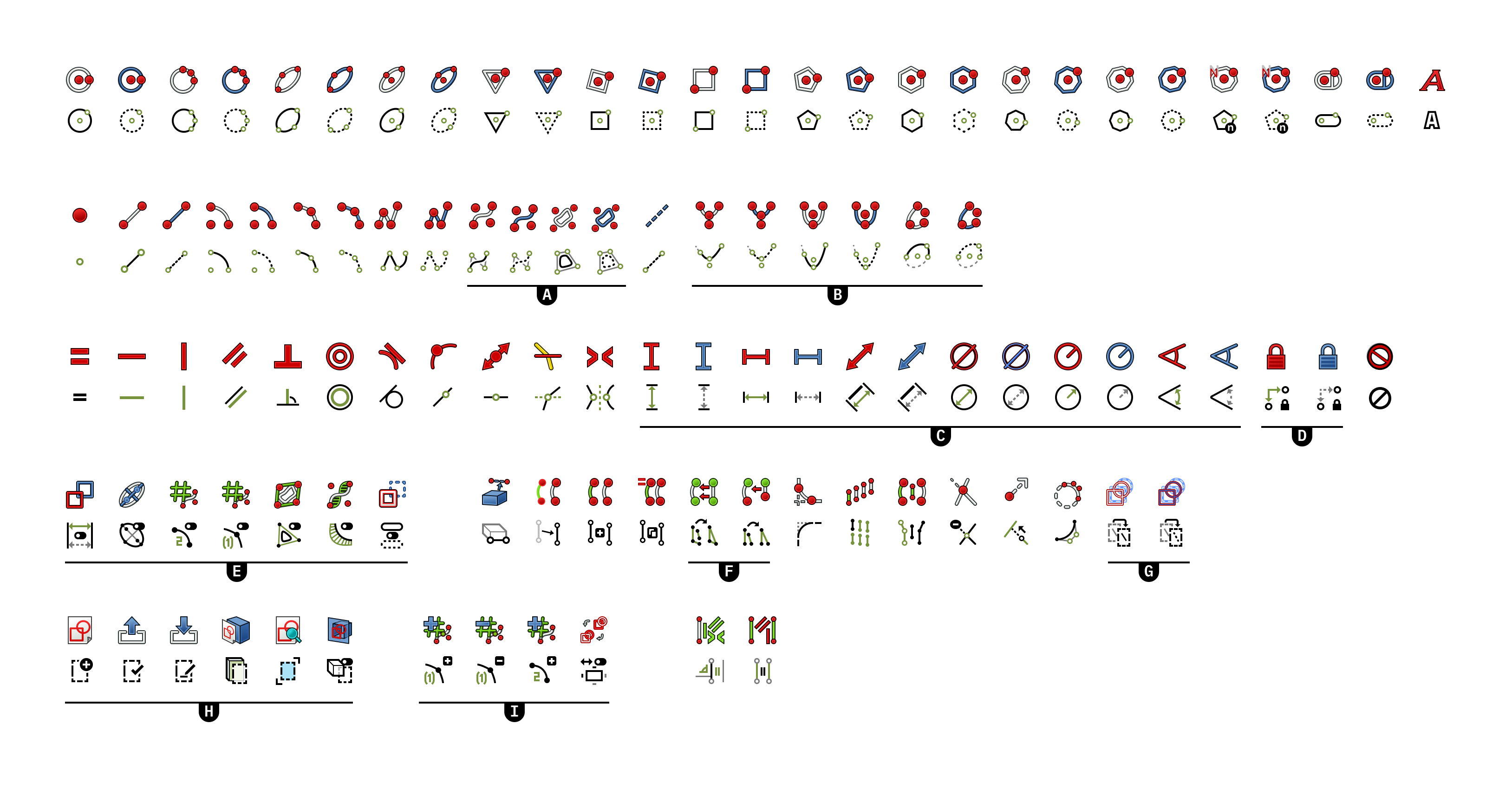
I wanted to highlight a few things:
- (Construction lines) The current icons are blue, because in drawings that is default construction line color. I switched to a dotted style to make it easier to switch from or to FreeCAD (in other tools commonly is dotted) — it also feels a bit more intuitive.
- (Driven constraints) I reused the dotted approach there too — it just felt natural.
- (A) I added the construction lines of the spline points, I believe this helps understand the principle of how splines work better.
- (B) The hyperbolic and parabolic icons are only partially drawn to indicate that this is possible. The full ellipsoid shape is indicated which should make it easier to understand the tool.
- (C) I worked more with arrows because I liked that in OnShape and it’s also how they actually look like in FreeCAD.
- (D) I found lock to be a bit confusing, because it normally refers to disabling something. I think this new approach is more self-explaining while keeping the lock.
- (E & I) To have toggles inside a menu bar is not a very common functionality, but I tried to make it a bit clearer by adding a toggle to the icon too. I also simplified the curvature comb a bit and tried to make the other icons to be a bit less abstract.
- (F) Those two were really hard for me to understand, so hopefully those are a bit more intuitive now

- (G) The current ones didn’t look much like copying from another sketch – I hope the new ones do. I also try to keep a consistent icon for sketches/drawings.
- (H) Just tried to add some consistency and make especially confirm and edit a sketch more intuitive.
Opinions are very welcome
———
I have two questions where it would be cool to have some help/opinions:
(1) Icon variations such as Sketcher_Element_Arc_StartingPoint:
I saw that e.g. for Sketcher_Element_Arc there is a variant for _StartingPoint, _MidPoint, _EndPoint and _Edge. However I haven’t seen those variants used inside the interface. Where are such variants used?
(2) Publishing this icon set:
I am thinking of publishing the icons also separately from FreeCAD since many of the icons could be useful in other projects too.
One question is what you think of this?
And the second question is regarding a license: I was thinking about picking CC0, because as a designer it can be hard to incorporate the license, especially for when you just need e.g. one icon for a certain project. So I’d rather make it more accessible even if it means I lose all ownership.
Any experience/thoughts/opinions on this?
———
Next steps:
I noticed that sometimes the contrast is not that great and that lines get very thin. But more importantly I wanted to get some consistency in how the colors and style is chosen (which are the main elements; which ones get generated/selected/set; etc.).
Maybe @abdullah could kindly help us here?
I really like the look of those icons. They are much cleaner than the old set and I will definitely use them. Great work thus far!
+1
Aren’t those the ones appearing when using the Elements widget for starting point / endpoint / mid point selection?
Just create in a Sketch a circle and a line. Go to the elements widget and press ‘z’ to iterate the selection mode.
BTW somebody sorted the icons into directories. Many thanks.
I love the new icons, when you combine them with my freecad-modern-config and a few more addons, it makes a really great interface.
In the pictures below I used the LinkStage3 branch and the SelectorToolbar, but you can also use the Glass addon from triplus.
I would like to point out that maybe the geometry elements and the contrains can be distinguished more clearly by color, then it is easier to find the things.
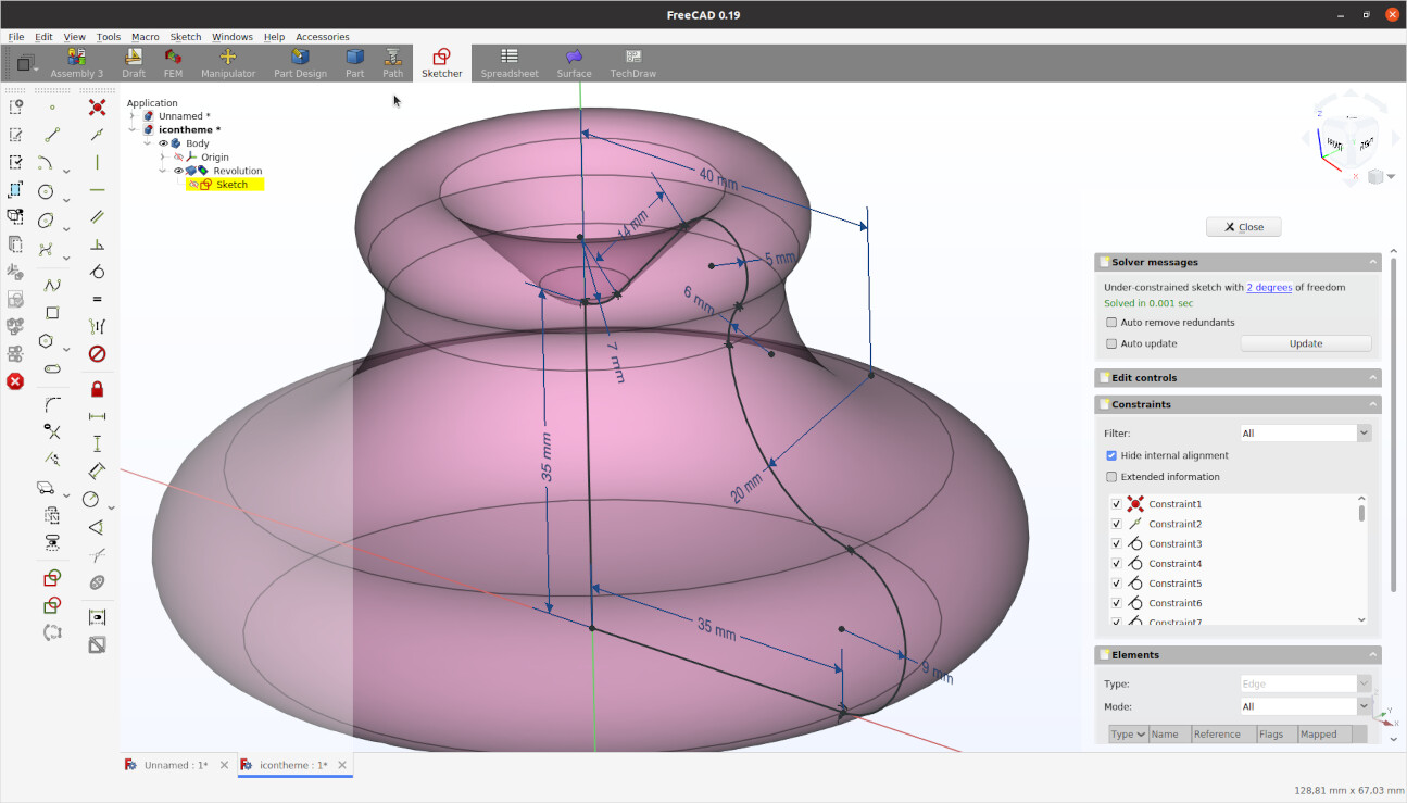
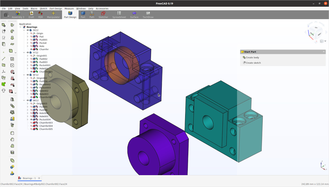
Started using them, much easier on the eye then the old ones. Looks great with Linkstage3 version and the transparant tree on the left side.
I just hope that there will be no copyright issues with the greedy commercial cad programs. We all know they are just after our money, one way or another.
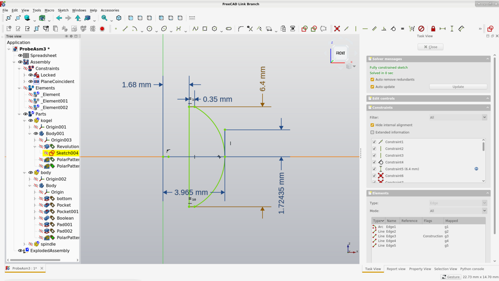
Thanks
———
Ah yes, there they appear! Thanks a lot for the hint.
I haven’t fully figured out what it does yet, but at least I know where to find them
———
Thanks a lot for posting that image! It’s really cool to see people already using it even though it’s not done yet
It really looks awesome – almost wants me make to stop working on the icons and work on the whole interface but one step after each other.
And thanks for the feedback regarding the color. I am always a bit hesitant to work with too much color in icons because there is always the question of what a certain color now means, but you brought a good point that it would make it easier to differentiate the different groups so to say. I’ll see what I can do for the next “release”.
———
Thanks for posting the image. As I mentioned it is really cool for me to see people trying it out already (especially in their themed version of FreeCAD).
I don’t really see a reason to be worried about copyright. Most CAD programs have somewhat similar icons because obviously they express the same things mostly (lines, chamfer, drawing, etc.).
Also I make all the icons manually, so it’s also a unique creation (that has somewhat its unique style … of course in the detail but still, its different looking to other CAD programs)
The elements’ widget allows to perform actions on individual geometries or part of geometries. It started to work-around the problem that overlapping points or lines could not be selected (today you can for example choose that construction geometry is shown on top, this was not available back them). Basically think that you can create any constraint without your mouse leaving the elements’ widget. It allows more than that, but that is how it started if I remember correctly.
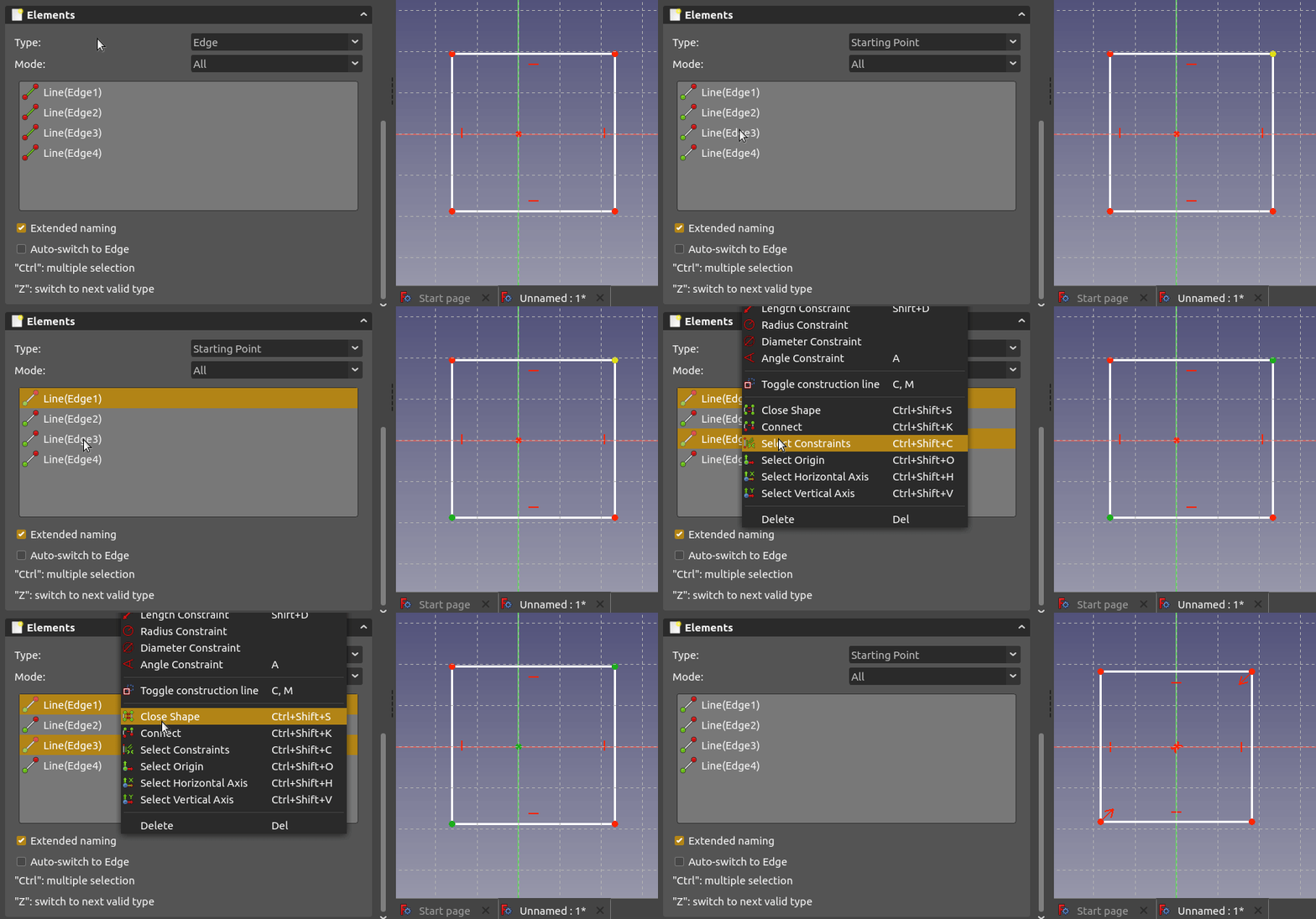
Thanks very much for these icons, st_phan. Together with dulouie’s modern-config macro, the effect is extraordinary.
I’ve noticed that the Sketcher ConstrainCoincident icon is missing from your comparison image, and you can see in dulouie’s screenshots that the default icon is still being used. Are you planning to create a new icon for that?
Ah that makes a lot of sense!
It’s actually a quite interesting functionality. Thanks for taking the time and explaining it
———
Hi Extracha,
thanks for the kind words. Good catch, I totally missed that because it wasn’t visible in my toolbar
I will include add in the next version.
The plan in general is to redo all icons – maybe they could become the default iconset for FreeCAD at some point.
But that endevour is quite large, so I just post an update whenever I have workbench (close to) complete or whenever I feel like it’s worth sharing.
Have you considered joining forces with RealThunder, to get your icons implemented as default in his releases?
Realthunder is making very good progress; implementing new features as he goes while updating the community.
He seems very open to input and cooperation.
My christmas wish would definitely be a cooperation between you two, starting with the modern icon theme, then moving
into the area of streamling workflow and making the overall UI/UX experience better
RealThunders patreon, with updates: https://www.patreon.com/thundereal/posts
OficineRobotica is making a nice effort showcasing RealThunders releases on youtube: https://www.youtube.com/watch?v=2R-NRKk6U8s
Can the modern Icon theme be installed via https://github.com/triplus/IconThemes ?
If so then why burden realthunder with the request to further diverge from the FreeCAD master branch. We don’t want his branch to become a fork instead we want his work to make it in to master. Every change he makes he has to maintain against the master branch, this means when he wants to sync his branch with master he has to play an intricate game for all the changes to live together. If the user can install a different icon set, that’s one/many less changes he needs to maintain and making merges back in to the master branch less complicated.
Exactly!
Just installed your icon pack through Triplus addon, and i’m enjoying so much the icons! They give a real boost to the readability of many commands. Thanks for your work!
Honestly, I haven’t heard about RealThunder before you mentioned it. Thanks for pointing that out and I am def. gonna have a look!
Maybe my addition to what the others have mentioned:
Why my goal would be for the icons to land in the regular FreeCAD is because I believe most users don’t bother to install any extensions/addons/themes/etc. They just stick to what they get straight out of the box. Not everbody is as passionate as we
I read the article “Set It and Forget It: How Default Settings Rule the World” a long while ago, that points out several aspects of our lives that are clearly shaped by what the default “setting” is.
I always have to think about this article, when it comes to conversations like this one
——
PS: Thanks to all the others for the kind words
PPS: The next iteration is coming soon
Hi st_phan,
A barrier to your excellent icons being included as the default icons is that they do not match the silhouetted constraint markers in the work area. The ‘Fix a point onto an object’ constraint icon looks very different to the marker, for example. Are you able to update the markers in the work area to match your new icons using the IconThemes workbench?

I believe those markers are pixmaps hard coded into FreeCAD and not easily customized.
Hi st_phan, I really like your icons. It gives Freecad a much needed modern look. I noticed that the icons are slightly smaller than the original ones. In my opinion the gap between the icons becomes to big. Small detail, not really important for now perhaps? But I wanted to show you with an overlay of the icons, see attachment.
None the less, I really like the icons and I’m looking forward to the next iteration.
