I’ve just had a quick skim through your icons: I have to say you have produced some very clean and well formed SVGs. Beautiful work!
I wish all the other svg images in the project were that well created!
Hi there, and a BIG THANKS for your work.
Really amazing and it cleans up a lot the default freecad’s gui.
It works well with the light-blue style applied, even if still i’m unhappy about some contrasts i have at screen.
I think the grey beneath some label/text can be avoided, and fonts has to be maybe a bit thicker.
I work all day long sticked to my lcd, and my eyes deserve a very relaxed environment.
Now that, thanks to your work, we have the right iconset (well, we WILL have, when its complete) i think its time to calibrate it upon a new stylesheet.
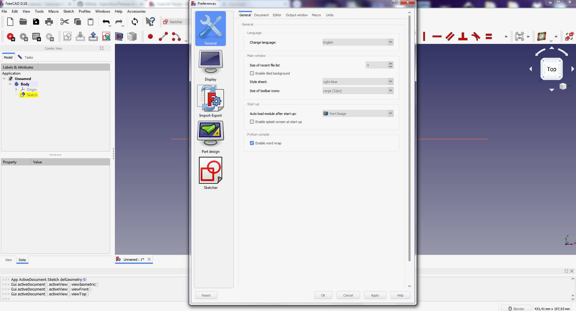
Like your work. Care to share the figma file?
Great work!
Only a observation for Macros icons. They only change the colors and that is not very good for people with color blind problems.
Please consider always different designs for icons for better identification rather than different colors.
https://forum.freecadweb.org/viewtopic.php?f=34&t=46887&start=10#p403395
Thanks for all the kind words and the helpful feedback.
And sorry for replying really late … I don’t why but I only now got an email notification about responses.
Unfortunately I haven’t made much progress – it’s my first real work in Open Source and it really is hard (as people say) to find time next to a full time job.
If anybody has tips on how to keep motivation going, they’d be welcome 
Sure, do you want the .fig export?
I’m thinking more of an online access. Like this: https://www.figma.com/file/QiSdiUf1vGO6KWdC3dIm6Z/FreeCAD?node-id=5%3A0
But if you don’t plan to continue, yeah, the *.fig file probably would be better
Look at the overwhelmingly positive feedback you’ve gotten already! Yes, time is always going to be a problem, and as an open source project the only compensation you will receive will be the gratitude of the community. But, the work you started is something that would benefit this project greatly in my opinion. Recently migrating from OnShape myself, I’ve found the default icon styles less than plain and generally unpleasant visually. I literally just created a forum account to:
- Thank you for your work so far
- Encourage you to keep going
I’ve participated in free/OSS projects in the past and it is often a thankless job and it is easy to fall victim to hecklers (not that I’ve seen any in this thread). But I very much hope you manage to find the motivation to see this project through to completion. The icons you’ve shown us so far look excellent already, even if you aren’t finished refining them yet. The overall improvement in user experience even something as simple as a refined and modern icon set would help not only the experienced user, but also newcomers and refugees from ‘freemium’ cad packages.
Just my thoughts.
Sending good opensource vibes as well 
Thank you all for your incredibly kind words.
That is actually already quite a motivational push
Thanks for providing access. I’ve made a copy just in case:
https://www.figma.com/file/g7WmhiormDyPj3Gt9SCc4i/FreeCAD-Icon-Theme-(Copy)?node-id=162%3A0
I’m impressed by your work so far Stephan, and I think your contribution is very valuable!
We need good coders and code reviewers, but the time for a UI push has come, so we need you on board
Speaking on motivation, that’s a good question. Maybe 1.5 hours work in the morning a couple of days a week, build a routine.
It might be on the side; but if you’re ever interested in visiting Norway, I’d gladly accomodate you in Voss. My home is open to contributors and people interested in digital fabrication. I’ve studied 1.5 years in Germany, so language is no problem. Maybe connections around the world, and cooperation can be a motivational factor?
I’m also playing with the thought of arranging an ‘Open source digital fabrication conference’ next summer in Norway. Combining knowledge about building low cost, large format CNC machines as a community, combined with a conference for FreeCAD as well.
The post got a little longer than intended, but cheers from Norway! Haakon
Those are some really nice icons! I will be using them for sure. Please keep up the good work!
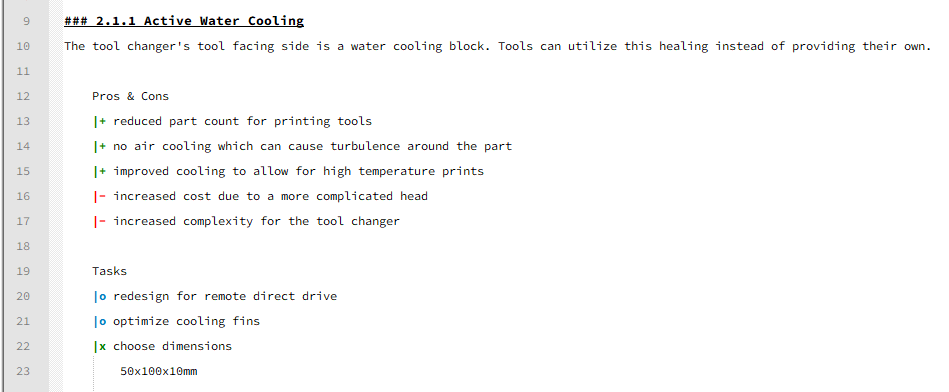
Whenever I have trouble motivating myself, it is usually because the reality of the project (i.e. the amount of tasks) is overwhelms me. In those situations I try to take a step back, organize all of my thoughts and plan the next stages. This includes a small README.md (I have one for every project of mine) where I outline the overall goal of the projects, intended features, technical challenges etc. I also track all of my tasks in there. A quick example:
Have you considered writing some guidelines so others can contribute icons? A guide like https://material.io/design (not as exhaustive of course  ) could be very helpful to others and might help you streamline your process. Some simple rules like these maybe:
-
Additive tasks use blue
-
Subtractive tasks use red
-
3D tasks use 3D icons
-
2D tasks use 2D icons
I’m loving these very much. Can’t wait to add some visual sugar to FreeCAD.
Is there a release of this?
A personal milestone
Thanks for all the kind words of you all, this made it really fun to make some progress!
The icons for the workbenches “Part” and “Part Design” are complete – not perfect but complete
(Note: I haven’t incorporated all the feedback regarding contrast/colorblindness/etc. yet but try to do my best)
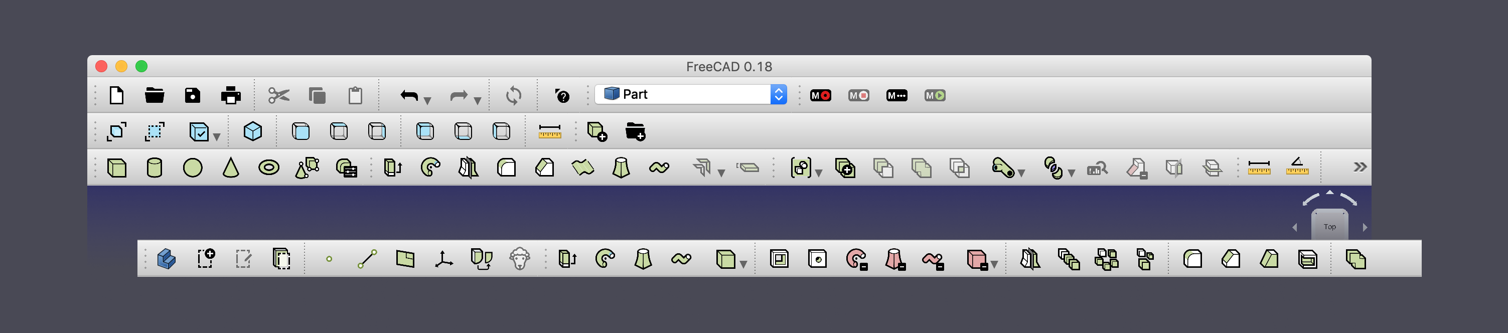
This is what an overview of all icons looks like:
If you want to check it out, here is the .rcc file as .zip (because I couldn’t upload the plain .rcc file here).
demo.rcc.zip (43.7 KB)
———————————————
I added the the .rcc file – you have to unzip it and follow the instructions from triplus awesome icon addon.
Let me know what you think – feedback is very welcome
Thanks for the tip of the readme and breaking the tasks into smaller chunks.
Even though it’s still a long road ahead it feels really good to now have completed parts of it
Good point with the routine. Corona actually “forced” me to have a small workout routine every day, maybe I can make it a workout + FreeCAD routine
Thank you A LOT for the invitation – this is so kind. I actually have never been to Norway, but that sounds awesome. Let’s hope the whole Corona situation is over in a few months, then I’d be happy to pay you a visit. It would be so much more fun to order a pizza and code/design next to each other
PS: The low-cost large format CNC machine project sounds cool and the open fabrication conference is an interesting idea as well.
I actually wanted to join an open workshop this year (where the have a CNC) but they currently have to limit access due to the situation being 
I find projects like OpenDesk or those joints adjusted for CNC really interesting … but I don’t want to spam this thread anymore Feel free to send me a PM
Incredible milestone and great work so far! Really enjoying what I see so far and I look forward to your continued efforts. This is not a trivial task and I find your icons clean, clear and easy to identify. Well done!
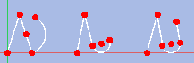
We had some time ago a discussion about the polyline icon. User are with some regularity surprised about the famous M key which makes the polyline so much more powerful. So we talked about an icon which was not only a zigzag bit had a curved line at the end.
Hey Chrisb,
I actually created two (but exported the zig zag one in the rcc file). I think I took the idea of the left one from Fusion360, but then stayed closer to the current FreeCAD one.
Is that something like you had in mind or something different entirely?

PS: Such feedback is very welcome, since I don’t know FreeCAD as thorough yet
Hi @st_phan,
I just installed your modern icon theme and I fell in love instantly. Your icons look so tidy and consistent … it’s a pleasure to work with them. Please continue your excellent work 
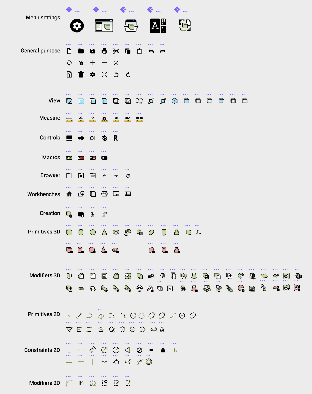
BTW installing your demo.rcc.zip I noticed that some of the icons shown in Screenshot 2020-10-21 at 01.37.45.png aren’t present in the Icon theme, for instance some of the Constraint 2D icons … see picture below. Is there some reason for that?

Thank you again for your professional work.
OS: Ubuntu 20.04.1 LTS (ubuntu:GNOME/ubuntu)
Word size of OS: 64-bit
Word size of FreeCAD: 64-bit
Version: 0.19.
Build type: Release
Branch: unknown
Hash: 1062b6ee0f90ae197bc816aebf4dcf1b1646aa30
Python version: 3.8.5
Qt version: 5.12.8
Coin version: 4.0.0
OCC version: 7.3.0
Locale: English/United States (en_US)
That’s indeed what I had in mind, although I would prefer a 3 or more element icon, e.g. like this - of course without the arc centers:
Edit: Formerly the parallel icon looked like a bigger equal sign. Distinction from the equality constraint was vastly improved with the current diagonal layout of the lines. I would keep that.
+1 from as well for the parallel symbol. It is a bit confusing if it’s horizontal.
But otherwise fantastic job. Keep up the good work.
Cheers