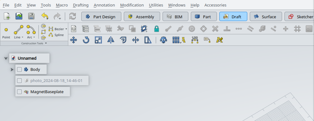
The only use I see for 3 sizes is the possibility of having both ribbons and normal toolbars. The ribbon uses the biggest and smallest icons while the toolbars use the medium one. Do you have examples of ribbons using 3 icon sizes?
We actually agree. It would be great if FreeCAD Nut could contribute to this. His work was impressive.
This is a good idea. Users will be able to test it, but being optional it won’t be a big deal if it’s not perfect from start. But we shouldn’t do like LibreOffice, and switch to ribbon as default once it’s mature.
Also a good idea to allow users to easily create custom ribbons, similar to custom toolbars.
I don’t really understand what you mean exactly. Surely not all buttons need labels - for example I don’t see a reason to label every constraint in sketcher, the icons are mostly fine there. However we should put as much labels as we can as this is the only way to explain most icons. We already know what they are doing - newcomers don’t. Generally unlabeled buttons are often considered bad UX practice nowadays unless the icon is very clear and easy to understand.
I honestly simply accepted that we won’t have icons that are sharp and good looking for every size. Here I used icon sizes of 40, 20 and 16 - we could reduce it to two sizes and come up with better aligned ones (like for example 32 and 16) but it won’t help much. Here you however have example on how it would look like with 32 / 16 icons only and some non-labeled. Again, this was not thought trough so choose of actions and what to label and not was pretty random. I do have a Figma (yes, I know penpot exists - I won’t use it until it sucks) design that I can share for you to play with it.
As Obelisk said - we need to come up with guidelines that can be easily followed by anyone as we won’t have one designer that sticks with us. Style from FreeCAD Nut is great but I doubt that any of us could reproduce it. Current design is good because it is easy to follow and works both for dark and light themes without altering. I even grown to like it over time.
This is not viable. Creating something like that would be a nightmare to merge and refactor and we won’t be able to fix all addons in the world. From development perspective it is much easier to evolve current solution than to try to replace it as a whole. One simplification that could be made is to simply not care about rowspan and simply accept that one row is for ribbon like toolbars and other ones are for normal - this is approach taken by the LibreOffice. This would simplify things grately, but I still would love to try to do better especially that it does not seem to be so hard.
This is the way that I want to go with, it must be customizable and it must be declarative - it cannot be defined in code only.
For example, in Part Design, “Subtractive loft” is currently two words. In the ribbon has one group for additive features and one group for subtractive feature, both “Loft” (= additive) and “Subtractive loft” could be named “Loft”, as the category name and icons would be enough to distinguish them. Another example in Sketcher, “Toggle construction geometry” is quite long and could be made shorter if the context allows it. Maybe I could search for the forum post that mentioned this—it’s not this one.
In your new mockup, there is an arrow near the group name. What do you want it to be? The equivalent in Microsoft Office is an option window with more extensive options than what’s displayed in the ribbon.
Based on the FreeCAD ribbon of geolta, I’ve created my own Ribbon. I’ve added a dialog to setup/change the ribbon. The dialog has five tabs:
Quickaccess toolbar
Exclude panels
Include workbenches
Create custom panels
Ribbon design
The most importent ones are “Create custom panels” and “Ribbon design”.
In the tab “Create custom panels” you can create your own custom panel based on the toolbars of the selected workbench.
You can combine multiple toolbars into one panel or create a panel based on one toolbar but with a different(shorter name)
In the tab “Ribbon design” you can set per workbench per panel:
The button size
The order of buttons
The text for the button (usefull with long button names)(double click on the first cell)
Set the order of the panels
The dialog takes a bit of time to load. This is because all the workbenches will be activated in order to get to all the commands and toolbars per workbench.
Because of this I’ve added a second dialog for general preferences.
You can find both dialogs under the application button. I’ve also added the uninstall script and a script to create an initial Json file.
This script creates a json file with every first command in a toolbar set to large. You can add your already customized parts of the Json file to it.
I believe this creates a nice start to a custom ribbon.
I’m currently testing the menu and creating a default design for a few workbenches. (PartDesign, FEM and techdraw are already there in the script.)
I’m using this to learn more about Qt and python and ultimatly create my own design for FreeCAD but maybe you can use this for the official ribbon?
You can find my version at: https://github.com/APEbbers/FreeCAD-Ribbon
Hi, I think, I definitely can add a few aspects to the topic of potential hurdles to the way of a ribbon – this was the whole point of creating this ribbon
kadet You can find them on the first pages of this thread. I have already created GitHub issues about the inconsistent and long names and the icon resolutions, but they were closed because a few people said that this is an issue of the addon and not of FreeCAD. Now the same problem is back and unsolved
I’m not sure if defining another property for Commands is good idea. All “toolbars” (ribbon groups) should not be auto generated from toolbars but defined in some form of configuration (for example read from JSON files) and I’d opt for defining labels per ribbon group as label for the same action in ribbon could be dependent on context anyway.
kadet you almost read my mind. I also believed that this kind of intermediate solution was the right one instead of going to Ribbon. The basic principle I mentioned before was Proportion or Domination.
I think my suggestion is more reasonable in terms of customizability. In this direction, there will be pre-prepared layouts that can be applied to toolbars. The user will be able to choose from these. Here, how many of these layouts there will be or how they will be presented is something that needs to be resolved later, but it is a huge plus that even the standard user will be able to change this easily. The icons will be placed in these layouts in their current order. Here, the second step for customization should be to change the order of the icons. In this way, the user will gain optional control over the tailor-made layouts. In this way, the idea of customization will be divided into two parts, I think it has been made easier.
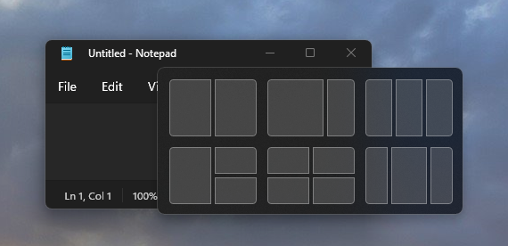
I am leaving this image to give you an idea. Of course, this is for windows, but you think about it for icons.